

Googlogology
/It's a made up word, but if the study of the evolution of the logo of the world's favourite search engine existed, that's what it would be called.
I'm not a designer, so I will resist the temptation to discuss the balance, the weight the leading, the kerning etc of the word mark. I just wanted to remind people how it has developed over the years (with acknowledgement to Lucia Peters and the Wayback Machine) and to point out that today's Big Reveal is the biggest single shift ever.
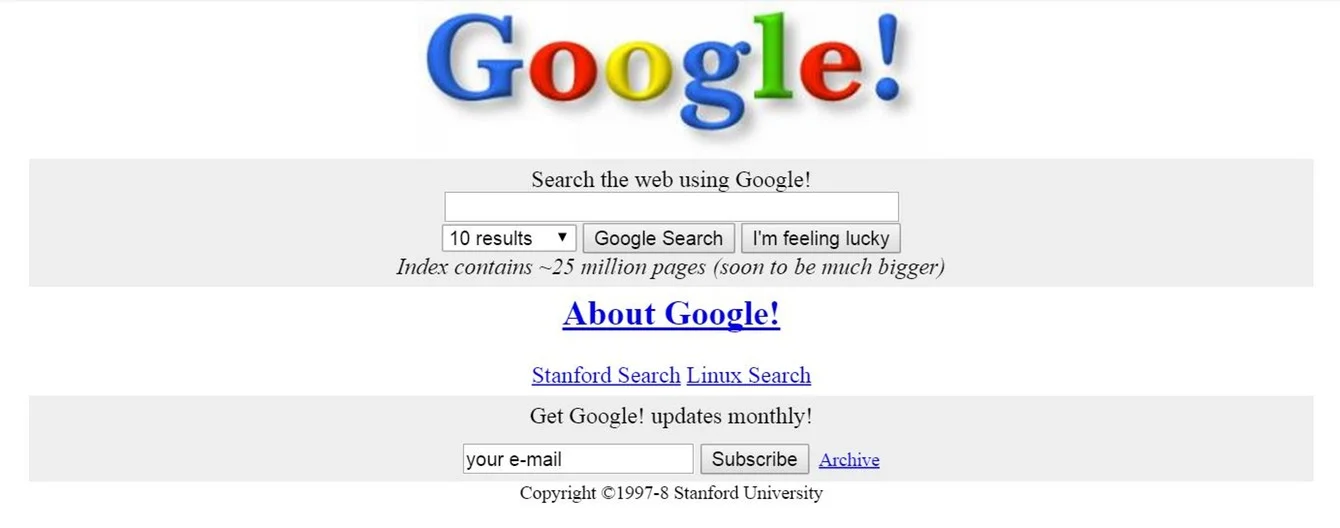
The Google home page looked like this around 1997:
...and then went through several revisions until arriving at this, which was current until earlier this year.

Recently, it Google removed the 3D qualities, making it all a little flatter...

...which paved the way for the drastically new logo we see today.

The Google press release explains the change by explaining that the original logo was designed for the desktop page. Clearly now we live in a multi-device, multi-platform environment, and this suits their needs better. Google has also said recently that it is launching a new parent company, Alphabet, creating a new structure that will more effectively accommodate the different business activities that carry the Google name.
It's all change at the world's favourite search engine - and nowhere is that seen more clearly than in the biggest logo overhaul since the company started. Exciting times indeed.
The question is: do you like it?
